Showing posts with label identity. Show all posts

7/8/09

Jesse Penico - Portfolio

His self-promotional stuff is blowing my mind! The use of anatomical diagrams is so cool.


Hello Monday - Portfolio

I love the rw/2 identity by Hello Monday. It's so simple and pretty.


Philippe Cossette - Portfolio

Some nice design from Philippe Cossette, a Montreal based designer. Check out his portfolio for more, and check out his logos - theres some great stuff in there.

Click images to enlarge


7/3/09

Thompson Brand Partners

I love this mailer from Thompson Brand Partners. The colour scheme alone is a reason to be cheerful! I have a thing for red and blue together though, so maybe my view is biased.

Contact them to receive the Reasons to be cheerful!

Click image to enlarge


6/30/09

Why not associates - Portfolio

I love it when you come across a portfolio that you love so much, you get disapointed when you've looked through the whole thing!

Click image to enlarge


6/21/09

Magdalena Czarnecki - Portfolio

Originally from Sweden, studied in Sydney - now she's looking for freelance work, and with a potfolio this pretty I don't see any reason not to hire her!


Marque - Portfolio

Lots of lovely identity work at Marque


Brice Domingues - Portfolio

Go check out Brice Domingues portfolio now. I'll wait...

I don't know where the work done from Janurary 2008 onwards is kept though. Or if there is any!


6/17/09

Coup - Portfolio

Coup from Amsterdam. Very nice things.


Elektrosmog - Portfolio

An identity for a film production company using post-it notes! Very clever :D


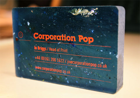
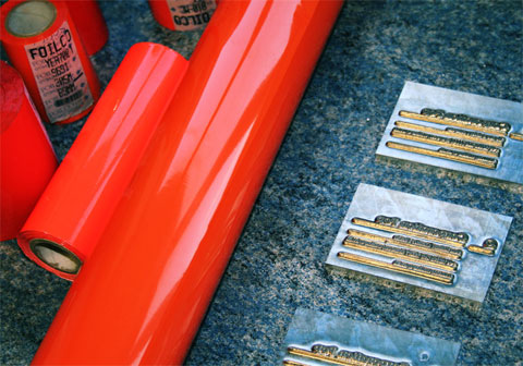
FPO - Corporation Pop Business Card

Check out For Print Only to see the thiskest business cards ever! I love how the plastic is full of flaws and little bits and pieces. Less of a business card and more of a business block.


I loooove that orange.


6/14/09

Phil Morris - Portfolio

The most awesome Morris since Zack.


Irish Museum of Modern Art - Project

This was a little project I set up for myself one day when I had nothing better to do. I was browsing the IMMA website and the whole design struck me as being very un-modern. I decided then to make a new logo for the museum, and maybe try to make a quick site redesign while I was at it.


This is the old logo, the first one taken from the header of the site. I played around with the eye image, trying to make it more interesting but I really wasn't feeling it. Because I was technically the client on this one, I wrote it out of the brief :P

I decided to just use the letters "IMMA". For a bit more interest I added a wavy line to some of the applications. When I made the line, I got a little excited thinking about it being used in motion graphics. For me, it brought the whole thing together.

As for the colours, I went with green and pink. The green representing Irish-ness, the pink was from the websites favicon - which is a pink feather.

Eyes, fingerprints, feathers!? You see now why I felt they needed a redesign :P


For the logo I was largely inspired by the simplicity of the MoMA NY and San Fransisco. They were two logos I always liked.


I spent a lot of time designing the logo and a few applications, and a little less effort on the site. I realize the design may be a little restricting of the content but I feel the design is an improvment on the sites current layout. I just think theres too much there at the moment. Theres four different menus on the homepage, I tried to trim it down to two (the footer menu isn't in the above image).

My favourite part is the business card, I'm really happy with how it turned out. If it were printed I'd probably want some gloss details on the logo on the back of the card.

Let me know what you think!! Better or worse?


6/11/09

Sam Frith - Portfolio

Some really fantastic stuff from an Austrailian based designer. Check out his CAC Signage work, really beautiful. It seems like every portfolio that really catches my eye these days is coming out of Austraila. If you're into Austrailian design scene as much as I am check out The Grafik Museum, a Blog showcasing the best of Austrailian design.

6/3/09

Dublin Bus Rebrand - Part 2

Some photos I took to expand on this post about the Dublin Bus rebrand. My photography skills are poor, and everything was so damn shiney! It seemed like I couldn't get any really good pictures.

Click images to enlarge

Prepaid Smartcard. I really like this design. Below is the old design for the prepaid tickets.


This is the ticket you get when you pay on with change.

This is the old version of the previous ticket. The machine would just spit out a random length of ticket (the one pictured is about 7 inches long, but the next time you get the bus it could be a quater of the size). The new tickets are smaller and more consistant in size.

A notice on the bus stop


Nitelink timetable

Nitelink logo.


This is the old Nitelink ticket. Fug. You can see the old bus design here, but for the sake of your eyeballs I'd recommend you don't! It's just the above ticket printed huuuuge on the side of a bus.
I don't know if they've made any changes to the bus design itself. I hope they did.


I spent all weekend looking out for these adverts on the sides of the buses, and didn't see any for long enough to get a picture. The top one was taken when I was sitting on a bus outside the Blanchardstown Shopping centre, the bottom photo was taken from my boyfriends apartment window. Obscured by the tree is the logo with the new tagline "The Bus. Do you get it yet?".


So far so good :D I'm really a big fan of this rebrand and everytime I see a new application of it I get a little bit excited.

Still on the list of pictures I'd like to record for this "project":
  • Old prepaid bus tickets (I must have a ton of these lying around)
  • Some more adverts/posters/notices
  • Timetables
  • Leaflets
What does everyone think?