Showing posts with label project. Show all posts

7/2/09

Gavin Potenza - Portfolio

Really fantastic work from Gavin Potenza. I love the Truth on Brands project, what it represents and how it's been executed. I'm a big fan of the simple vintage style.

Cultural statement based on how brands have changed their ideals and fundamentals throughout the years. Inspired by the words of Marty Neuemeier and how brands no longer aim to communicate what they represent but rather attempt to cater to the consumer's varying interests.

Check out his portfolio for a whole load of awesomeness. http://www.gavinpotenza.com/

Click image to enlage


6/15/09

Personal Business Card - Project

Two business card concepts I came up with yesterday. I'm going to try and make some more applications before I commit to anything, just to make sure it works with everything.


Let me know what you think!


6/14/09

Irish Museum of Modern Art - Project

This was a little project I set up for myself one day when I had nothing better to do. I was browsing the IMMA website and the whole design struck me as being very un-modern. I decided then to make a new logo for the museum, and maybe try to make a quick site redesign while I was at it.


This is the old logo, the first one taken from the header of the site. I played around with the eye image, trying to make it more interesting but I really wasn't feeling it. Because I was technically the client on this one, I wrote it out of the brief :P

I decided to just use the letters "IMMA". For a bit more interest I added a wavy line to some of the applications. When I made the line, I got a little excited thinking about it being used in motion graphics. For me, it brought the whole thing together.

As for the colours, I went with green and pink. The green representing Irish-ness, the pink was from the websites favicon - which is a pink feather.

Eyes, fingerprints, feathers!? You see now why I felt they needed a redesign :P


For the logo I was largely inspired by the simplicity of the MoMA NY and San Fransisco. They were two logos I always liked.


I spent a lot of time designing the logo and a few applications, and a little less effort on the site. I realize the design may be a little restricting of the content but I feel the design is an improvment on the sites current layout. I just think theres too much there at the moment. Theres four different menus on the homepage, I tried to trim it down to two (the footer menu isn't in the above image).

My favourite part is the business card, I'm really happy with how it turned out. If it were printed I'd probably want some gloss details on the logo on the back of the card.

Let me know what you think!! Better or worse?


Wallpaper* Magazine - Sex Issue

Wallpaper* magazine has invited 250 of their favourite designers to reimagine the “tart card”, the adverts used by London prostitutes. Smutty, cheeky fun :P


Also part of the Sex Issue, check out Airsides blog for some sexy lady-letters :D Rawr!!

6/12/09

Sandra Kassenaar - Portfolio

This style is something I'll never get sick of - so get used to it!!!!!!


And it makes me want a silkscreen printer. Someday (read: never) I might build one.

Wedding Invites

Best wedding invite EVER. Normally I go ga-ga for all letterpress invites, but these are the exception.


monsieur Qui - Illustration

Wooooow. Amazingly pretty illustrations from monsieur Qui. Shop coming soon.....


6/9/09

Trailer Park Paddies - Project


I do a lot of work for my sisters and their Mongol Rally team The Trailer Park Paddies.

This is the latest piece of work I've done for them, a poster for a Pub Quiz they've orgainized.

Click image to enlarge

Here's some work I've done recently.


This is an unused site header design...

...this is the one that's in use.

Crew tees

The back of the tee with a misspelling. I should change that :P

6/3/09

Dublin Bus Rebrand - Part 2

Some photos I took to expand on this post about the Dublin Bus rebrand. My photography skills are poor, and everything was so damn shiney! It seemed like I couldn't get any really good pictures.

Click images to enlarge

Prepaid Smartcard. I really like this design. Below is the old design for the prepaid tickets.


This is the ticket you get when you pay on with change.

This is the old version of the previous ticket. The machine would just spit out a random length of ticket (the one pictured is about 7 inches long, but the next time you get the bus it could be a quater of the size). The new tickets are smaller and more consistant in size.

A notice on the bus stop


Nitelink timetable

Nitelink logo.


This is the old Nitelink ticket. Fug. You can see the old bus design here, but for the sake of your eyeballs I'd recommend you don't! It's just the above ticket printed huuuuge on the side of a bus.
I don't know if they've made any changes to the bus design itself. I hope they did.


I spent all weekend looking out for these adverts on the sides of the buses, and didn't see any for long enough to get a picture. The top one was taken when I was sitting on a bus outside the Blanchardstown Shopping centre, the bottom photo was taken from my boyfriends apartment window. Obscured by the tree is the logo with the new tagline "The Bus. Do you get it yet?".


So far so good :D I'm really a big fan of this rebrand and everytime I see a new application of it I get a little bit excited.

Still on the list of pictures I'd like to record for this "project":
  • Old prepaid bus tickets (I must have a ton of these lying around)
  • Some more adverts/posters/notices
  • Timetables
  • Leaflets
What does everyone think?

5/21/09

Felix Lobelius - Graphic Designs

Some really awesome work from Mr Felix Lobelius who lives in Oz. The country, not the fictional prison. 


I hate that they stopped making Oz, and also a bit pissed about what they did with Alverez at the end. He was one of my favourite characters! He also did the voice of Jackie in the Darkness computer game, which Mike Patton also worked on (he did the voice of The Darkness) I know Oz ended like 6 years ago, I should be over it, but I'm not. I heard that Kirk Acevedo guy got fired from Fringe too. Fringe sucks anyway.

Mike Patton also did the voices for the creatures in I am Legend, and for some mysterious reason gets credited on one of the GTA games (Vice City or the one before that)

I retain a lot of useless information, but always forget important things. Like putting in a link for Felix Lobelius's site! 

5/20/09

LGBT Noise

This is a brochure I made for LGBT Noise


Click on the images to make them bigger, and check out how much people loove my flyer! (above)


Drop by LGBTnoise to support the cause.


Muxtape - Project

I decided to make my little sister a mix of music I liked and stuff I thought she might like. This is how it went:


So after the five seconds I spent to picking the music I got to work on the cover:


I wanted to give it an old mix tape style, this is what I came up with.

Let me know what you think (of my design and my choice of music!)


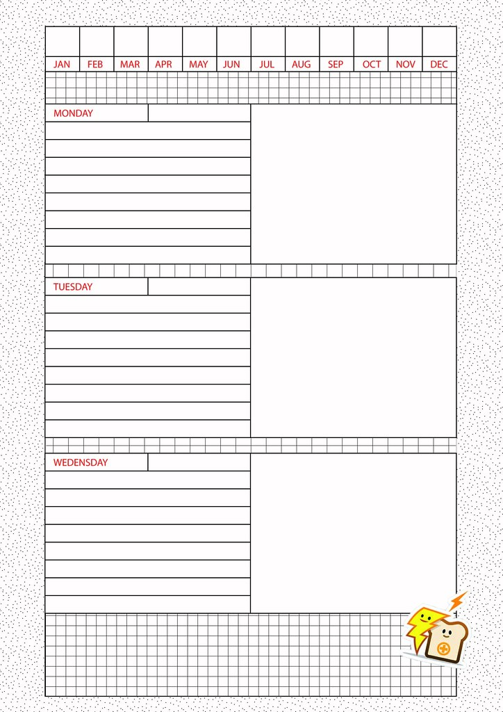
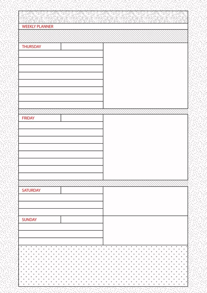
Weekly Orgainizer - Project

This is a personal project I've been working on. I wanted a weekly orgainizer. My mind instantly went to filofaxes, but they are so expensive so I crossed that off.

After shopping around I couldn't find any I liked so I decided I'd have a go at designing my own! This is what I came up with.


You fill in the date in the appropriate month box (like 18-24) then go ahead and plan your week!

The areas with the patterns are designed for sketching and scribbling in, because even if those areas were left blank I'd probably end up scribbling there anyway.

I have a folder that I use all of the time, so I'm just going to punch holes in these and stick them in there. Pretty clever, I know!

Also, bread for POWER!


The Dollar Red$ign project

The dollar is waaaay too iconic to change, but thats not gonna stop these designers! 
From the site: 

Dollar ReDe$ign Project
We need to rebuild our country, revive our economy, redesign the Dollar bill. Email us your ideas. Win a prize. Join in. In God we Trust. In Change we Believe.


A few dodgy designs, but some interesting concepts too, it's still early days so I'm going to be keeping an eye on this one!