
Laters!!!!!
5/22/09
See ya Monday!!
I won't be posting over the weekend, as I'm visiting my boyfriends family in Wicklow.
Desres - Graphic Design
Desres is a design studio in Frankfurt.
I love the die cut cover on the kombinatrotweiss mailer.
Click images to enlarge


Who are we - Graphic Design
Who are you? Not a lot of info on the site itself, but one thing is clear - they/she/he have produced some kickass work.


Ros Shiers - Graphic Design
I love her delicate illustrations, sooo girly!
Click on images to enlarge

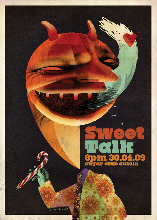
I was at this event and they were giving out free prints of the posters designed by the three illustrators who spoke at it, and I really wanted to grab this one but by the time I got through the crowd they'd all been taken.
I don't mean to sound like a snitch, but people were totally breaking the one poster per-person rule. I can understand wanting to get one of each of the designs, but people were just grabbing three or four of the same poster! Ahh I'm just bitter I didn't get the one I wanted :P
It really shows how much I love Ros's style, that I was itching to get this poster even though I'm pretty sure I can't stand to look at Agyness Deyn's face for much longer.
I got the poster made by Jonathan McHugh instead, which once I got it out of the darkness of the venue, I realised it was way cooler than I had originally thought.
The lettering on the above is by BrenB


Sizes may vary - Design Book
Damn I should have stuck this in my notebook post. I bought a copy of Sizes May Vary just before Christmas and I use it all the time! It's a sketchbook/reference book/notebook built for designers. It has pages and pages of templates for everything you might need, business cards, envelopes, CD's, Billboards, Bus Stops and lots more.
I'm a bit reluctant to draw into the book itself, because it doesn't feel right. All those years of teachers giving me shit for doodling all over my school books have really stuck with me. But luckily for me they've included a disc with all the content of the book, so I just print out pages whenever I want them! It's really handy.
It comes with a paper size chart, which I have hung up on my wall above my desk, and more size guides in the back.


5/21/09
Lotto Rebrand - Graphic Design
This is kind of old, but still a good one! I love the rebrand, I have a soft spot for a brand that uses lots of different logos really well, especially when you look at the previous mess of bad logos. It even won an Award.
I pretty much like everything about the logo. The font is fun - as is the color scheme. And the little star mascot is really well executed. The only thing I'd change would be the website - they've encorporated so much colour into the new identity, yet they've used one shade of green for the whole website. I can't help but think that it would look better with just a simple background colour change.
 National Lottery Annual Report 2008 PDF
National Lotto Website
Guidelines PDF
The people behind the rebrand:
Ahhhhhh lovely :D
London Design Festival - Pentagram
New York Design Week has just ended, but this September London will be awash in the distinctive red and white of the London Design Festival. For the third year running Domenic Lippa has reprised his role as the art director of the festival, which is the umbrella organisation for London’s annual celebration of design. The Festival was announced by Festival Chairman Sir John Sorrell and Director Ben Evans at a launch last week at the V&A.
The theme of this year’s Festival is “Be Bold” and serves as a challenge by the Festival organisers that events be provocative, inspiring and unique. With designer Jeremy Kunze, Lippa has created the look and feel for the Festival. A feature of this year’s identity is the use of quotes from famous designers, including Pentagram co-founder Alan Fletcher (see the designer tote above).
From Pentagram


Om nom nom nom nom
Objectified screening - Dublin
In case you haven't already heard, the IFI in Dublin are hosting a special screening of Objectified on June 2. Not only that, their also having a Q&A after the show with director Gary Hustwit
I've got my tickets already! Get yours NOW!
Check out the Objectified website for screenings near you, and for a lot more information about the movie.

The items on the bottom row of the above poster are all the objects they used to make the movie! Clever.
Felix Lobelius - Graphic Designs
Some really awesome work from Mr Felix Lobelius who lives in Oz. The country, not the fictional prison.


I hate that they stopped making Oz, and also a bit pissed about what they did with Alverez at the end. He was one of my favourite characters! He also did the voice of Jackie in the Darkness computer game, which Mike Patton also worked on (he did the voice of The Darkness) I know Oz ended like 6 years ago, I should be over it, but I'm not. I heard that Kirk Acevedo guy got fired from Fringe too. Fringe sucks anyway.
Mike Patton also did the voices for the creatures in I am Legend, and for some mysterious reason gets credited on one of the GTA games (Vice City or the one before that)
I retain a lot of useless information, but always forget important things. Like putting in a link for Felix Lobelius's site!
Planners/notebooks - it's like porn for me
I've posted my own weekly planner design before, here's my favourite planner and notebook designs from all over teh interwebs.
Click images to enlarge
- Some seriously sexy stuff from Düller

- Present & Correct - Retro Stationary
I love love LOVE Present and Corrects vintage desk accesories. They seriously blow my mind.


You can't go wrong with Moleskine! I lust after the large red plain notebook. Om nom nom.
I own the Dublin city notebook which I'm filling with cool stuff for designers to do in Dublin. It's really handy for going to meet clients as it has pretty decent city maps in it too. (Keep an eye out for a Designers guide to Dublin for Designers! Coming soon to a blog near you...)

I love the dot grid book, it's a great alternative to graph paper - I find it a lot less restrictive. I haven't bought the book, I just print out dotted sheets from illustrator and stick them in my folder. But that doesn't mean I wouldn't accept one as a gift. *cough*

The Action pad is an all-time favourite of mine. I can't decide between the orange and blue though. I'm leaning more towards orange because it would sort of match my mug.

- Ooh la la! http://www.colette.fr/ is tres magnifique!
Collect your notes and/or sketches on Archie Grand notebooks and their inspiring titles such as: “Art directors I met and liked”, “Artists I met and liked”, “Nobels I met and liked”... or just new for colette "Fashionistas I met and liked" and "Socialites I met and liked"

Day book (fighter of the night book?). The cover is very nice, and comes in three different colors. This grey one is on my wishlist.

- A whole pile of awesome Korean planners and notbooks at MMMG
First, a pre-sketched planner! Really pretty designs, but I prefer to make my own sketches.


A cute three-pack of planners (I have no idea what the collective term for planners is). Only 5900won! I admit, I have no idea if thats cheap or a rip off. Whatever it is, I'd pay it!!!

- I don't have an Uncle Bob, but that doesn't matter!
An eight day planner, Monday to Tuesday and Someday.


Another eight day planner, but this one has a blank page on the right for doodles.
tomtor - Graphic Design
Tom has earned many awards including the United Nations Award of Excellence in Geneva, International Human Rights Award, and Design of Excellence.
Beat that!


Dublin Bus Rebrand - Part 1
I just wanted to make a little post about the Dubilin Bus rebrand which happened last year. I'm a big fan of it. My favourite part is what they've done with the Nitelink posters/signage. I couldn't find a lot of pictures (and living within walking distance of town means I never use the Nitelink anymore!) but it looks great. It's all set on a black background whereas the regular bus timetables/posters are white.
The only thing I'm not too fond of is the font. They've gone with Helvetica, which works really well - but just seems like a bit of a no brainer. It's a huge improvement over the old identity though, I don't like the CIE2000 font much at all!
I've heard that they're moving away from having a unified brand with Iarnród Éireann and Bus Éireann. Iarnród Eireann have retained their old logo (with the CIE2000 font) and Bus Éireann have jazzed up their logo.
Click images to enlarge


These are the timetables which appear on the bus stops. The old one consisted of stickers which would often be peeled off - which was a pain in the ass. The new ones (below) are placed behind clear plastic.


 These are the designs for the prepaid tickets. I'm going to try to get more pictures of the entire range because they come in lots of nice colors. Also, I need to add pictures of the tickets you get when you pay on the bus with change. The design of those is a lot better now.


I'll try and get more images of posters and other stuff, but right now I've only got what I was able to find on the internet. I'll get around to taking some better pictures - someday.
I give the new brand a high five on a scale of "Down with that sort of thing!" to "High Five".
The people behind the rebrand are ImageNow as far as I can tell. Their site doesn't seem to have anything about it.
Subscribe to:
Posts (Atom)


